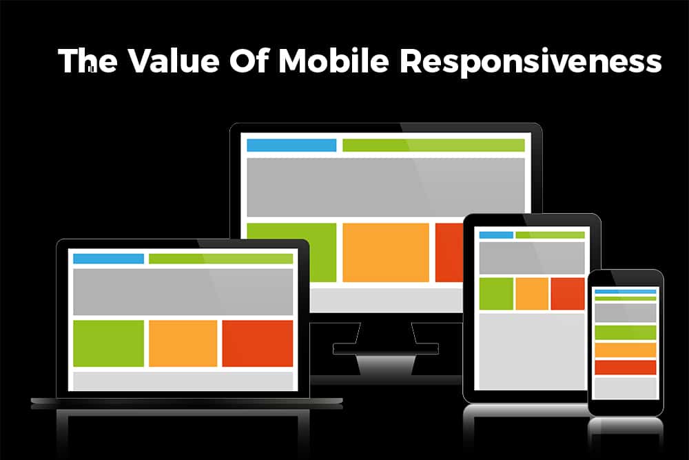
Desktops still exist, while laptops are getting sleeker and smaller. Tablet companies are expanding and enhancing their product lines–some are getting larger, while some have smaller versions. Lastly, mobile phones are getting bigger and computer-based watches are on the market. With the exception of watches, websites can be visited on any of the devices listed above. If your business was being featured, wouldn’t you want it to be displayed equally beautifully and easily navigable on every device? Of course. That’s called mobile responsiveness and you’re going to learn all about it.
What Is Mobile Responsiveness?
Our unofficial colleagues at Studiopress said it best (and it never hurts to link other valuable resources to our readers through us): “When a website is responsive, the layout and/or content responds or adapts based on the size of screen they are presented on. A responsive website automatically changes to fit the device you’re reading it on.” — Source: StudioPress
Why Mobile Responsiveness Matters
Three things make mobile responsiveness important: trust, user experience, and functionality. In laymen’s terms, you would want your business to be trusted by people who visit your website. You want them to easily navigate your pages and find what they’re looking for. You want the layout and design to flow so they can enjoy the experience. Personally, if we visit websites and get an error via Google Chrome that its unsafe or we’re leaving the domain server we originally clicked, we are out. Who in their right mind would go to a website that is throwing up errors before you even land there? Maybe hackers on the dark web, not us.
Multiple Versions Of Your Website
Yes, indeed. You should have multiple versions of your website to ensure the content is properly distributed across desktop, laptop, tablet and mobile devices. And no, it’s not as complicated as it sounds! That’s the best news. When using the right types of website builders (like WordPress), you can simply enable and disable certain modules across desktop, tablet and mobile platforms. Think of it as a visibility toggle.
Certain modules will be necessary to showcase on desktop platforms such as those that give away the most information. You’re building an official version of your website for desktop and laptop users. More space available on the screen means more information can be shared. Then think of it as a downgrade process. Tablet users might not need all that same information. On the other hand, it might not look as good to fill the tablet screen with the same content as on the desktop-ready version of your website. Consider what information would be best suited for the platform being used by consumers.
The Occasional MOBILE Responsiveness Hurdle
Have you ever opened a website on your phone and seen the entire website as it looks on the desktop? You’re viewing the desktop version on your mobile device at that point. Some mobile websites have a clickable link that is displayed as “view full desktop site.” Depending on your business and audience, it might be worth it to include this link. However, ensure your website does not automatically open the desktop version on a mobile device. That can be a real pain in the rear to navigate as all the text will be shrunken tremendously.
Mobile Responsiveness vs. Mobile-Friendly
You may have also heard the term “mobile-friendly.” Even though they both begin with “mobile,” they are different modes of delivering information. As explained already, mobile responsiveness design is a design feature that is properly read by mobile devices. Mobile-friendly design encompasses something different–where one design is simplistic for desktop and a little more informational heavy for mobile. It’s the same website designed in a way that will flow well on both desktop and mobile platforms.
The Bottom Line
What’s the bottom line? Build your websites on a large screen — a desktop if possible. Have a tablet and phone nearby to use and judge your creations. See what changes on the tablet version need to be made before publishing live. Repeat the same process for mobile. Of course, you’ll have your phone with you since it never leaves your side.
If you don’t have the time or don’t want to put in the extra effort to make your website dynamic and smooth across all platforms, keep it simple, stupid. Keep it simple with a mobile-friendly design to start and branch out as you grow and allocate more revenue towards marketing. Maybe at one point in the near future, you’ll outsource your marketing efforts so you can solely focus on your business.
Thank you for your attention! To bring this blog with you offline for reference, click the eBook image below!


Recent Comments